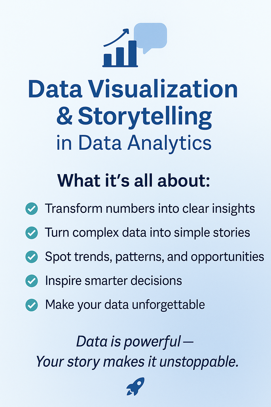
Welcome to Phase 5 of your data journey! Knowing how to analyze data is essential — but being able to communicate those insights visually is what makes a data analyst truly powerful. This module focuses on building interactive dashboards and using storytelling principles to drive decisions.
StoryTelling.png
🔧 Tools We’ll Use
- Power BI
- Tableau
- Google Data Studio (Looker Studio)
1️⃣ Connecting to Data Sources
Learn how to bring in data and prepare it for visualization:
- 🔗 Import from CSV, Excel, SQL databases, APIs, and cloud platforms
- 🧼 Clean and transform data directly in Power BI/Tableau/GDS
- 🧱 Understand basic data modeling concepts (relationships, data types)
🎯 Activity:
- Connect a sample dataset (e.g., Sales or Customer Data)
- Perform data prep and transformation inside the visualization tool
2️⃣ Creating Interactive Reports
Make your dashboards dynamic and user-friendly:
- 🎛️ Use filters and slicers for interactivity
- 🔍 Add drill-downs and hierarchies for deeper exploration
- ➗ Create calculated fields and measures
- Power BI → DAX
- Tableau → LOD Expressions
💼 Project:
Build an interactive Sales Performance Dashboard with user controls and filters.
3️⃣ Storytelling with Data
Turn dashboards into narratives that lead to action.
- 🧭 The 5-Step Framework:
- Context
- Exploration
- Insight
- Narrative
- Action
- 🧱 Structure dashboards to guide your viewer
- 🎨 Use colors, annotations, and layout for clarity
✍️ Exercise:
Take a cluttered dashboard, and improve it using storytelling techniques.
4️⃣ Advanced Visualization & Insights
Choose the right chart for the right message:
| Insight Type | Best Charts |
|---|---|
| Trends | Line Charts |
| Comparisons | Bar, Column Charts |
| Distributions | Histograms, Box Plots |
| Relationships | Scatter Plots |
| Density & Patterns | Heatmaps, Bullet Charts, Custom Visuals |
🚫 Learn how to avoid misleading visuals and emphasize data integrity.
🧠 Case Study:
Review real-world dashboards and identify areas for improvement.
5️⃣ Customizing Dashboards & Communication
Make your dashboards polished and presentation-ready:
- 🎨 Apply branding and UX/UI best practices
- ✍️ Write clear, actionable data summaries
- 🎤 Present findings with confidence and clarity
🧪 Capstone Project:
Business Case: Executive Dashboard
- Choose a real-world dataset (e.g., E-commerce, Finance, HR)
- Build a dashboard that tells a data story
- Present insights to a mock stakeholder or client
Objectives:
-
Use Power BI or Tableau to build an interactive dashboard
-
Visualize:
– Sales by region
– Top products
– Sales trends by month
– Filters for date/product/category
- Bonus: Add narrative insight in a separate text card or presentation
🎯 What’s Next?
You’re now equipped to tell stories with data — one of the most in-demand skills in today’s market. In Phase 6, we’ll explore Statistics & Probability for Analytics, unlocking predictive insights and hypothesis testing.
Good dashboards inform. Great dashboards inspire action.

