

Welcome to Phase 2 of your data journey! In this module, we explore two of the most powerful and accessible tools in a data analyst’s toolkit: Microsoft Excel and Google Sheets. Whether you’re prepping raw data or creating dynamic dashboards, this guide will help you master it all.
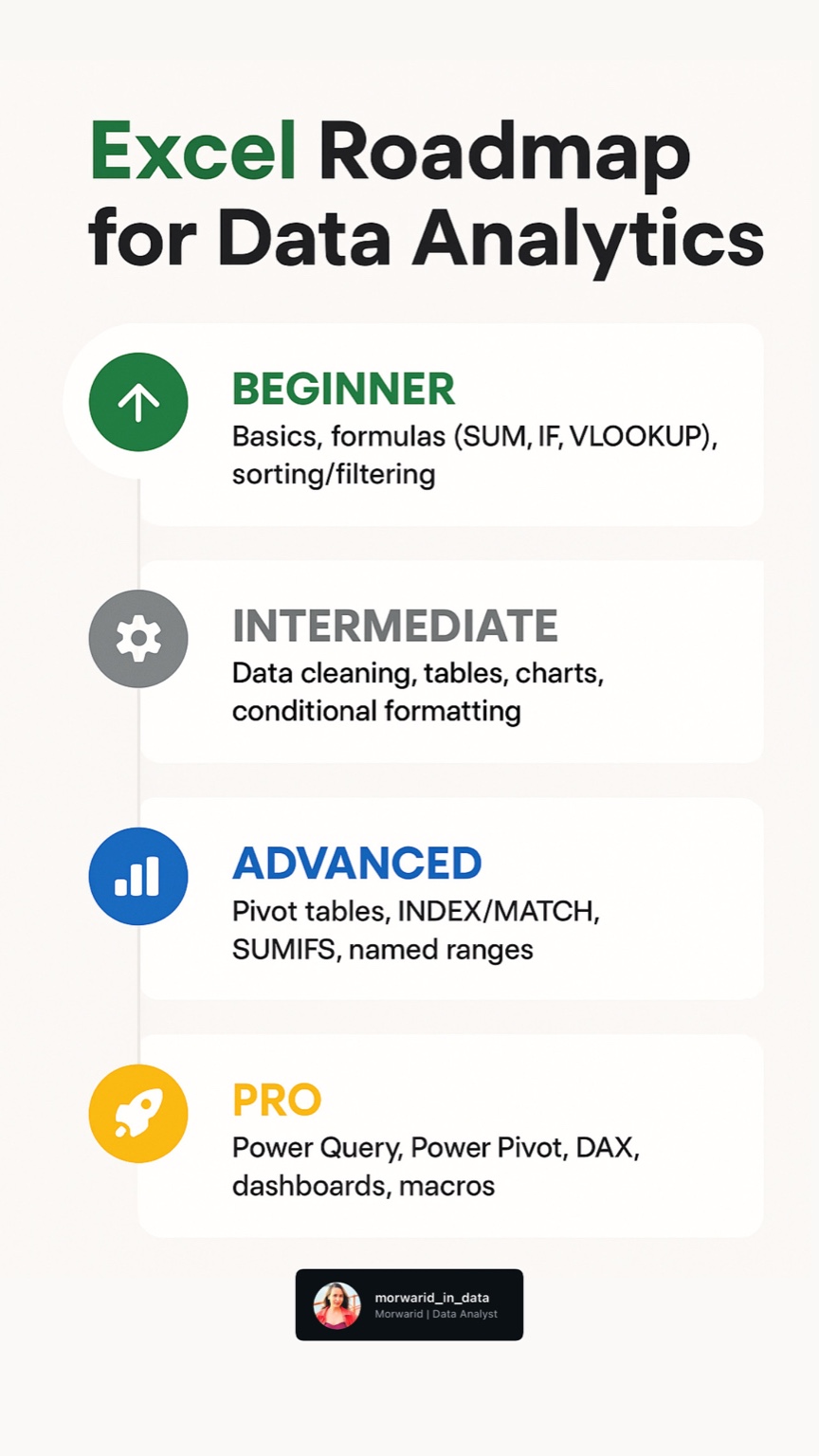
1️⃣ Fundamental Functions & Formulas
Familiarize yourself with the Excel/Sheets interface and master foundational functions:
- 🔢 Basic Functions:
SUM,AVERAGE,COUNT,COUNTA,IF,TEXT,CONCATENATE - 🔍 Lookup & Reference:
VLOOKUP,HLOOKUP,INDEX-MATCH,XLOOKUP - 🎯 Conditional Logic:
IF,IFERROR,AND,OR - 📊 Aggregation:
SUMIFS,COUNTIFS,AVERAGEIFS
💡 Pro Tip: Use INDEX-MATCH instead of VLOOKUP for more flexibility and performance.
2️⃣ Pivot Tables & Data Analysis
Pivot Tables are your best friend when it comes to summarizing large datasets.
- Create dynamic pivot tables in Excel/Sheets
- Group, filter, and sort data efficiently
- Add calculated fields for extra insights
- Build pivot charts for visual storytelling
⚙️ Use pivot tables to identify trends, patterns, and outliers quickly.
3️⃣ Data Cleaning & Formatting Best Practices
Dirty data? Not anymore! Learn how to clean and prep your dataset like a pro:
- ❌ Remove duplicates and blanks
- 🔤 Standardize text with
TRIM,CLEAN,PROPER,LEFT,RIGHT,MID - ✂️ Use Text to Columns and Flash Fill for quick splitting/merging
- ✅ Apply Data Validation for consistent inputs
- 🧹 Leverage Power Query for large-scale data transformations
4️⃣ Conditional Formatting & Data Validation
Make your data more visual and reliable:
- 🎨 Apply color scales, data bars, and icon sets
- 🧠 Build custom rules with formulas
- 🔽 Create drop-down lists and dependent lists
- 🧯 Use error checking to prevent bad data entries
🎯 Great formatting makes your data easier to read and analyze at a glance.
5️⃣ Advanced Excel for Analytics
📈 Dashboards & Reports
Take your reporting skills to the next level:
- Build interactive dashboards with slicers & timelines
- Use a variety of charts: line, bar, scatter, waterfall
- Connect to live data sources for real-time reporting
🧰 Power Query for Data Transformation
Master Excel’s built-in ETL tool:
- Import & merge multiple datasets
- Clean & reshape data with Power Query Editor
- Automate refreshes for up-to-date reports
🤖 Automate Tasks with Macros
Streamline your workflow with automation:
- Record and edit Macros to reduce repetitive work
- Get started with VBA (Visual Basic for Applications)
- Automate routine data cleaning or formatting tasks
🎯 What’s Next?
By the end of this phase, you’ll be equipped to clean, analyze, and present data confidently using spreadsheets. In Phase 3, we’ll dive into SQL for data extraction and querying.
Project: “Monthly KPI Dashboard for an E-Commerce Store”
Objectives:
-
Use dummy data (sales, customers, product returns)
-
Apply formulas like VLOOKUP, IF, SUMIFS
-
Create pivot tables and slicers
-
Design a dashboard using charts (bar, line, pie)
-
Bonus: Add automation using simple Macros or Google App Script
Consistency is key — the more you practice, the more fluent you’ll become in spreadsheets.